McDonalds POP Advertising
GSP Investigates What They Are Currently Doing
As the trend to expand foodservice operations and increase fresh food offerings at convenience stores continues, c-store retailers are finding themselves competing more and more with the QSR industry.
Steven Cohen, GSPs Vice President of Design Services, and some of his team members, visited some recently renovated McDonalds to take a look at their POP advertising, to see what types of signage they are using and what new trends or innovative techniques they have incorporated. Heres the result of their findings.
1. The Arch
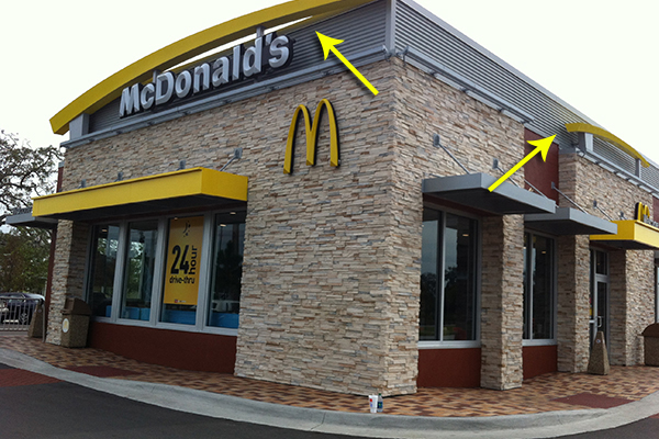
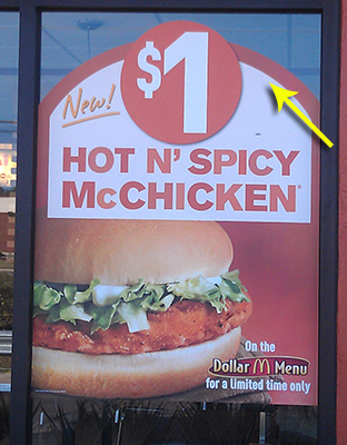
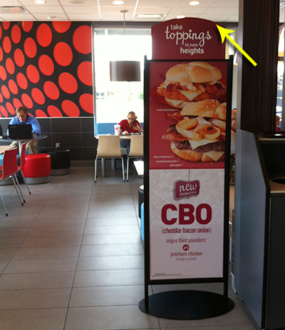
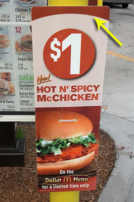
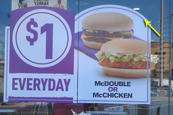
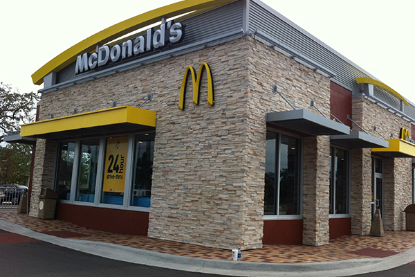
In the images below, notice how the well-known McDonalds arch is represented on the storefront trim and in their graphics a subtle way to imprint their brand on each promotional element.
2. Photography Use
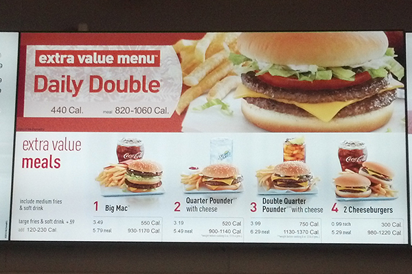
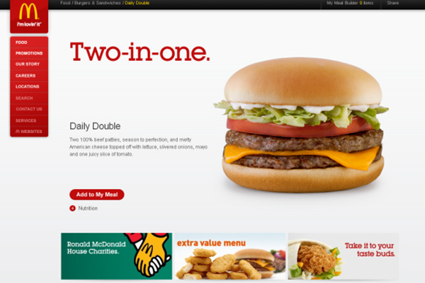
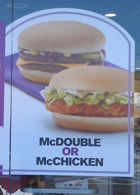
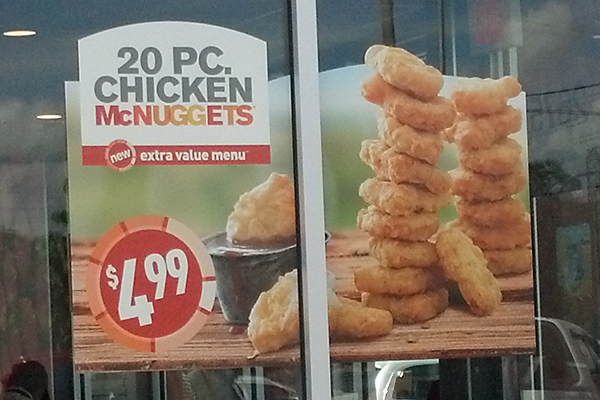
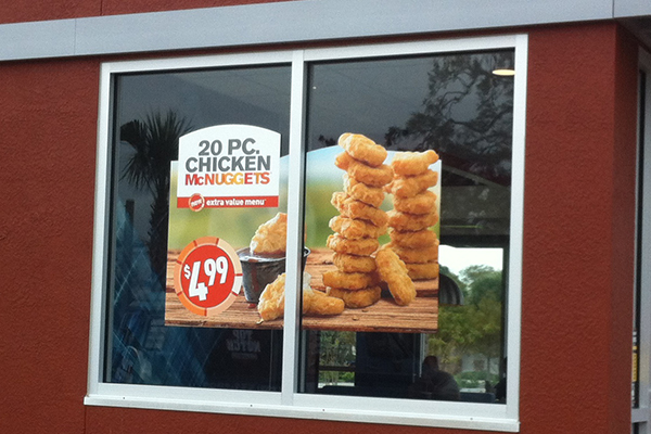
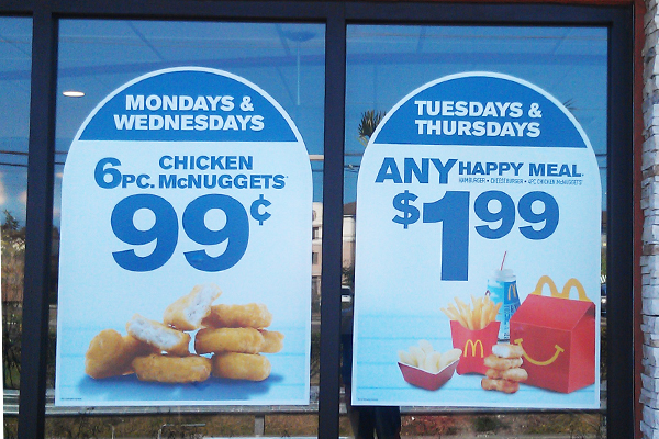
The McDonalds signage and website incorporates professionally shot photographs that support their brand. The images are shot with minimal styling on white, color and location backgrounds. In each case the food is hero and impact is made, as demonstrated by their window graphics and menu signage.
3. Less is More
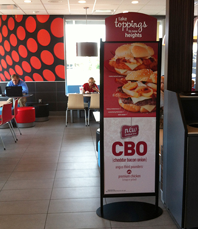
Instead of a lot of small signs, they utilize large simple messages, like the pictured standee highlighting the new CBO sandwich and key POP advertising signs on the windows.
4. Shapes
Window banners are utilized to highlight product specials and big ideas. They avoid the ordinary rectangle, and use custom-branded shapes to capture the customers attention.
5. Destinations
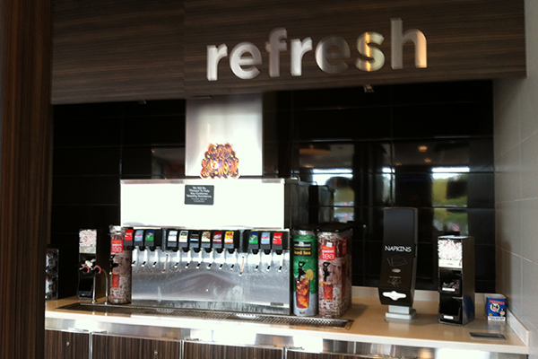
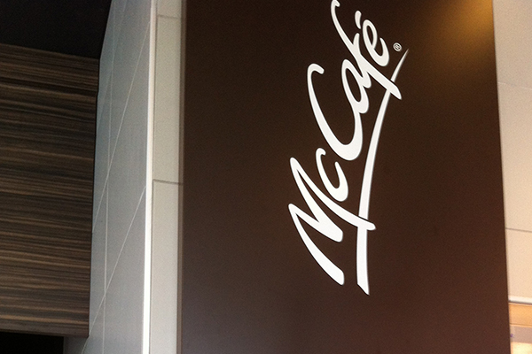
They have branded destinations for an enhanced consumer in-store experience.
In summary, McDonalds uses a powerful graphic approach, professionally shot images and takes advantage of every opportunity to reinforce their brand. The result is a clear, easy to understand communication to their customers.