‹ INSIGHTS | RETAIL BETTER BLOG
SIMPLE DOES IT...A LOOK AT MCDONALD'S POP
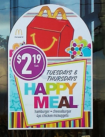
March 26, 2014 by Elaine Scrima – Utilizing inspiration from the “Golden Arches,” McDonald’s sometimes uses simple arch-shaped window graphics to communicate timed promotions, price impact and the power of new products. Below, a review of a McDonald’s POP program:


Create Urgency with Timed Events
Promotions on specific days create a sense of urgency and drive traffic. Recurring timed events encourage repeat business – customers recall the timed promotions and plan to return for the offering. Highlighting different food promotions on different days is also a good way of appealing to a wider range of customers, creating excitement and will increase sales on those featured items.

Price Impact Draws Attention
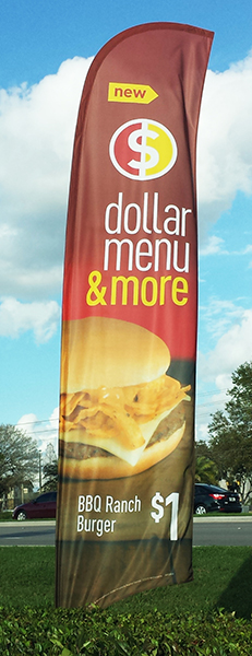
Highlighting a low promotional price with large, easy-to-read price points captures consumer attention. McDonald’s window decals are clearly readable to parking lot and street traffic. Lower-priced items from their dollar menu are placed to be visible to the highest traffic areas, ensuring maximum impact.

The Power of New
“New” when used correctly can be very powerful. It introduces a product, it says “try me” and can draw attention to an item to create a buzz. “New” works best when used in conjunction with a new product launch. Remember new can’t be new always—examine what new means for you in terms of timing.
Utilize these simple yet effective POP ideas from McDonald’s at your stores—for impactful POP that will deliver results.


