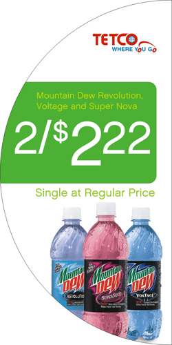
What's in a square?
Using non-traditional shapes for P.O.P. can go a long way towards getting your signs noticed
 What is in a square??? When it comes to point of purchase displays apparently not nearly as much as a circle, or just about any other shape for that matter. What is in a square??? When it comes to point of purchase displays apparently not nearly as much as a circle, or just about any other shape for that matter.
Most traditional promotional P.O.P. is produced with square corners and straight edges. There is no mystery why it is done this way… its cheaper. But there is a fine line between cheap and effective and with the new contour cutting technologies that exist today those lines and barriers are rapidly converging.
In the point of purchase industry there is something called the “wallpaper effect”. Traditionally that phrase refers to promotional graphics that are left up for so long that they become a part of the décor and ostensibly far less noticeable to the consumer. Recent research has started to show that the same phenomenon occurs when your promotional displays are the same shape from month to month even if the graphics change.
There is so much visual communication in the world today the mind’s eye has started to develop an immunity to its presence, unless, of course, we are tempted by something different. Sure the same rules apply with regards to P.O.P. design:
1. Make sure your offer is compelling
2. Use high contrasting colors
3. No more than 7 words
4. Use a readable font
But in today’s marketplace that may not be enough. The answer… incorporate all these tried and true practices along with the use of unique shapes to capture the consumers eye.
Despite the fact that technology has improved making contour cutting of short and long run graphics more cost effective it does still add costs. But that doesn’t mean you cannot take advantage of this trend. By printing on clear material you can design and produce square cut signage that has the appearance of being contoured. Either way you get the same benefit of increased visibility of your POP displays which in the end should help to drive sales.
|